|| VINTAGE PASTEL TABLE SETTING DREAMS: HOW I STYLED IT ||

I’ve had visions of this table setting dancing in my head for a while - itching to flex my styling muscles once again and create something beautiful rather than just the same standard stock photos day in and day out. This is what you used to do, I would remind myself, knowing that styling & making things pretty has had to take a back seat to the less fun parts that come hand in hand with running a business… I kept thinking I would make time for this idea when I wasn’t so low on energy, when I wasn’t so low on creativity, when I had the space to do so. But the energy & creativity hadn’t come back, and despite me putting this idea together as a something that could tie in with the festive season I found myself a few days away from Christmas still having done nothing.
I was about ready to give up on it and let it evaporate into the abyss where all unfulfilled ideas go, when I saw a story from my lovely friend Abbey at Peach Vintage. Struggling with low energy & creativity herself, she suggested putting the action before the energy - that maybe if we start doing the thing first the energy will follow, just from us taking the steps to start. So, I did. I decided to just start on the small step of selecting all the pieces I would use to style my dream vintage pastel table setting, and the creativity flowed. Even though it was creative and fun, it was also methodical and purpose driven - this time I just put the method & purpose first and the creative & fun second.
I thought I would take you through my process and method of creating this entire setting, so that maybe it can help you can style your dream table, too 🥰

STEP ONE: Identifying my hero piece
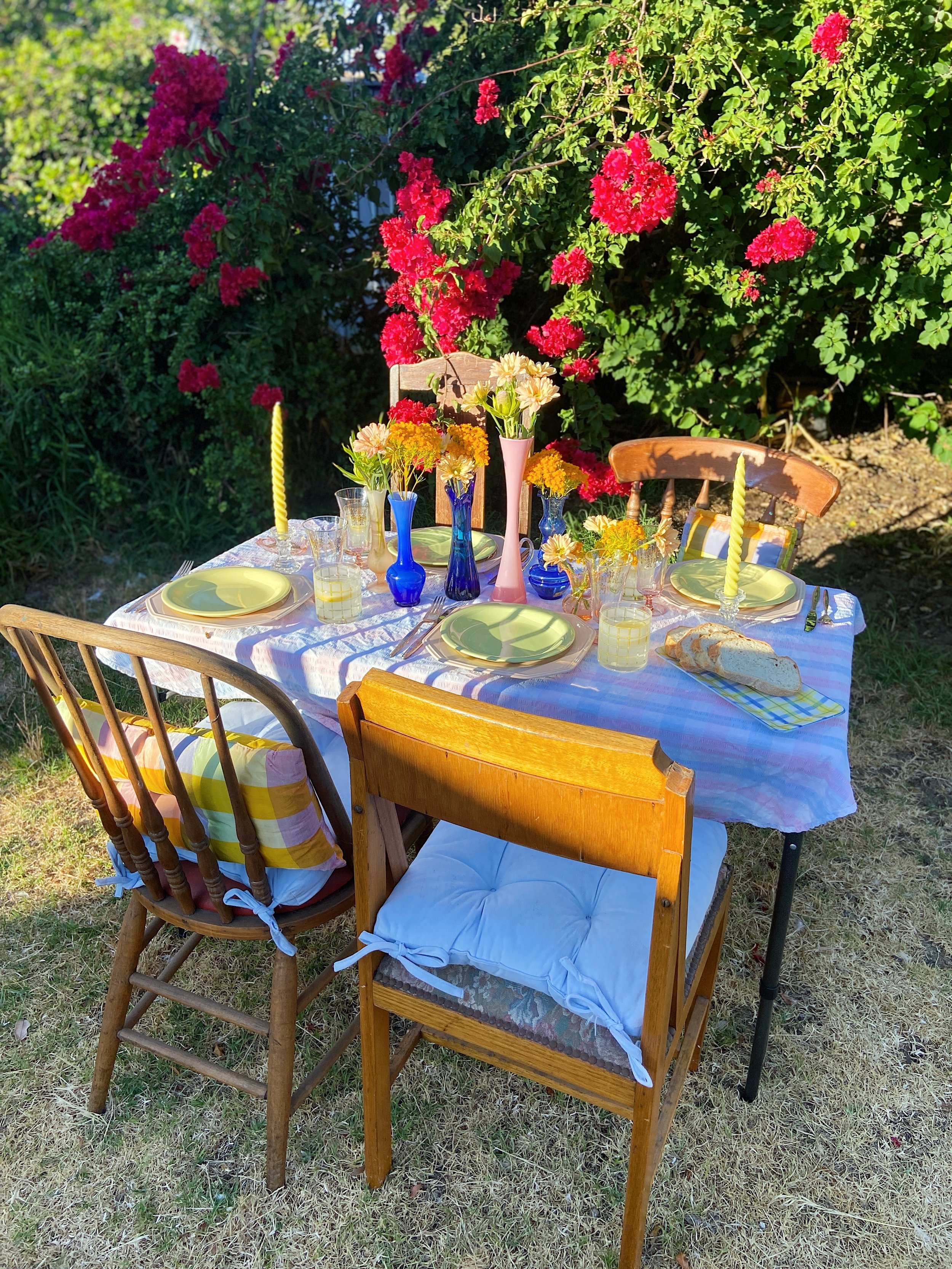
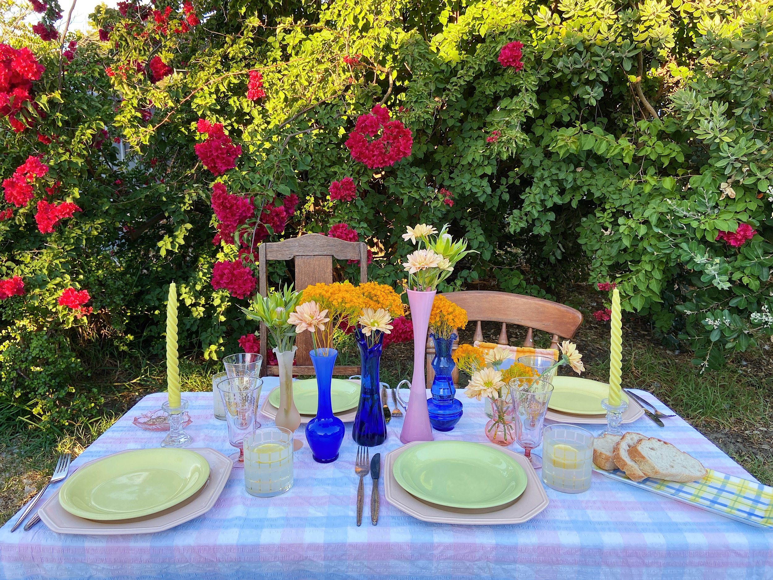
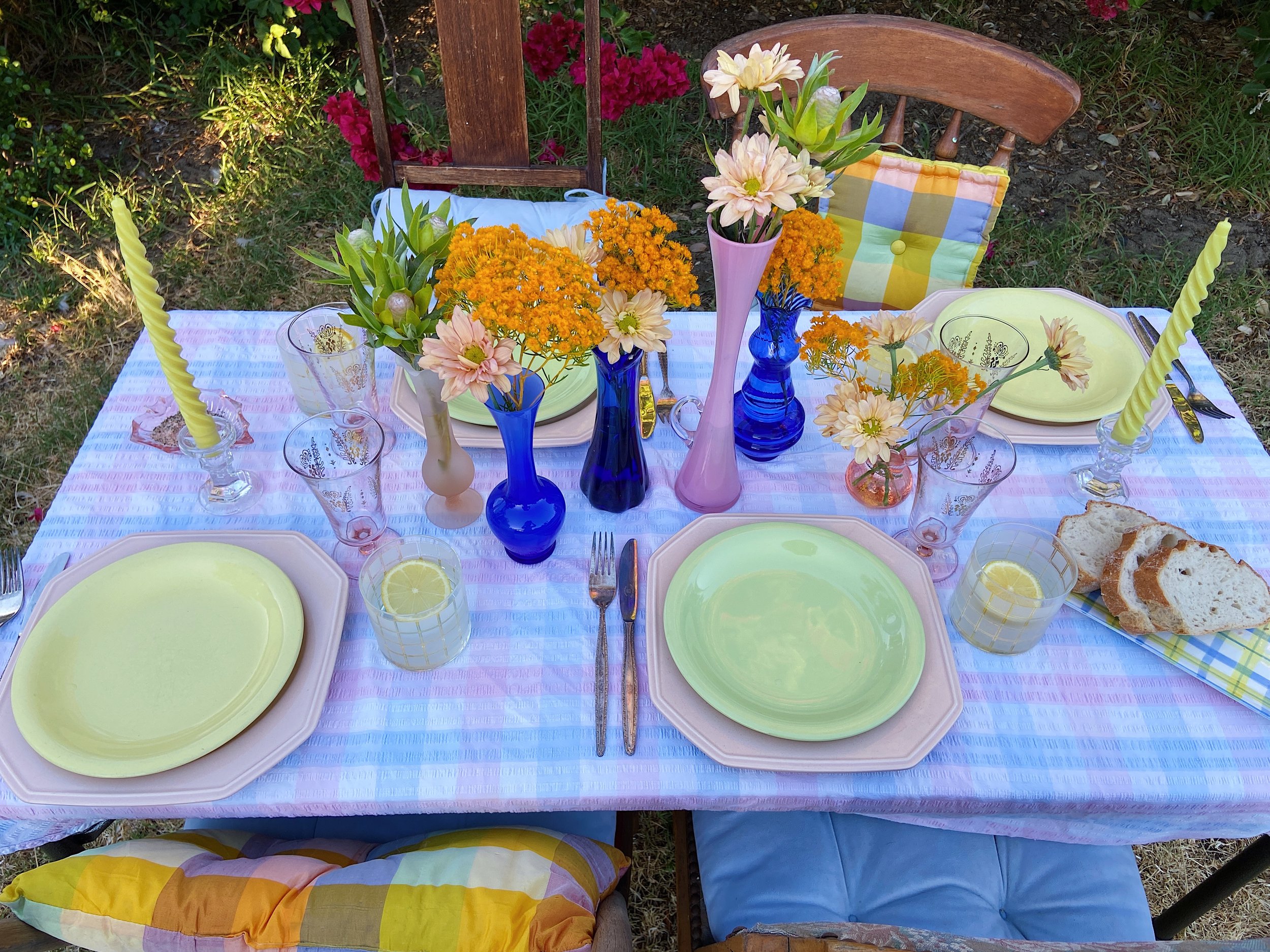
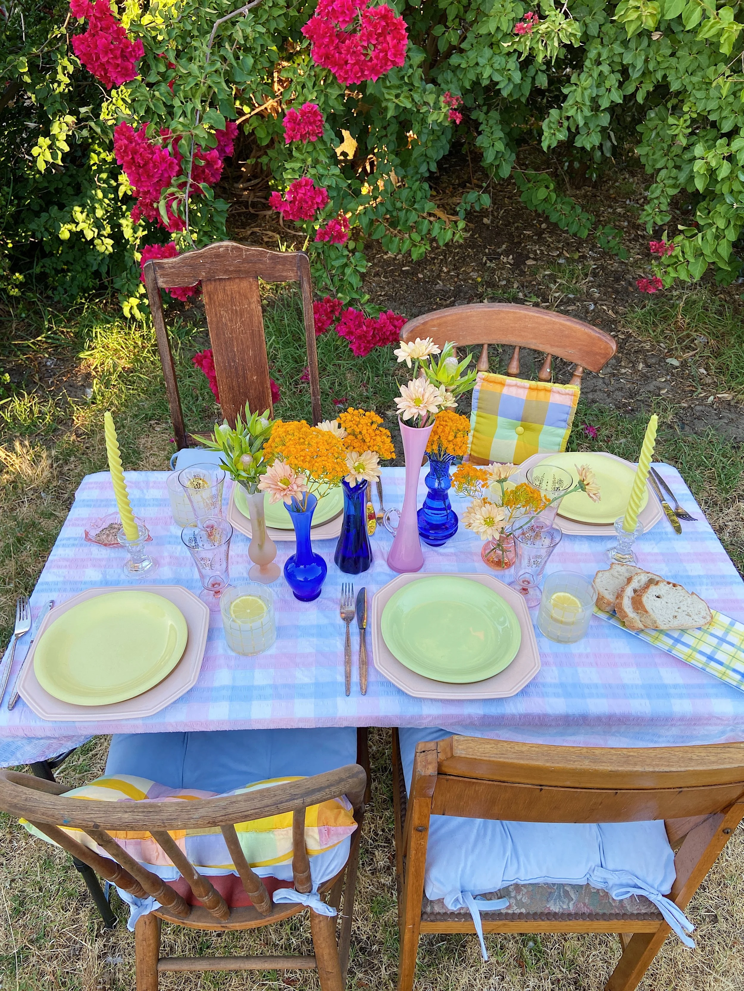
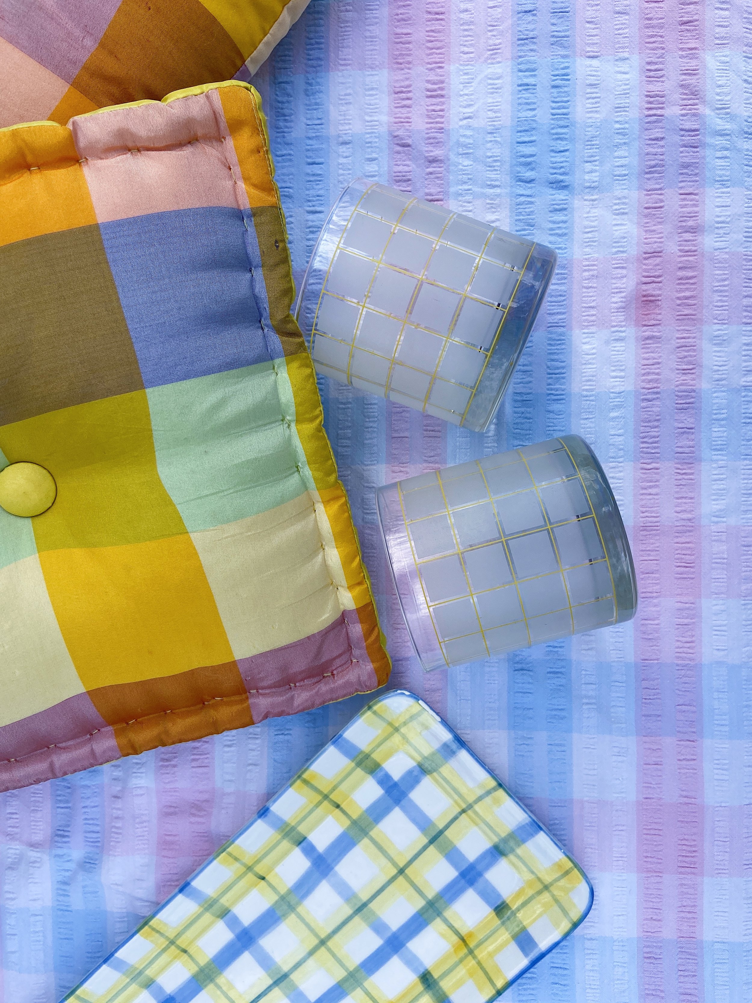
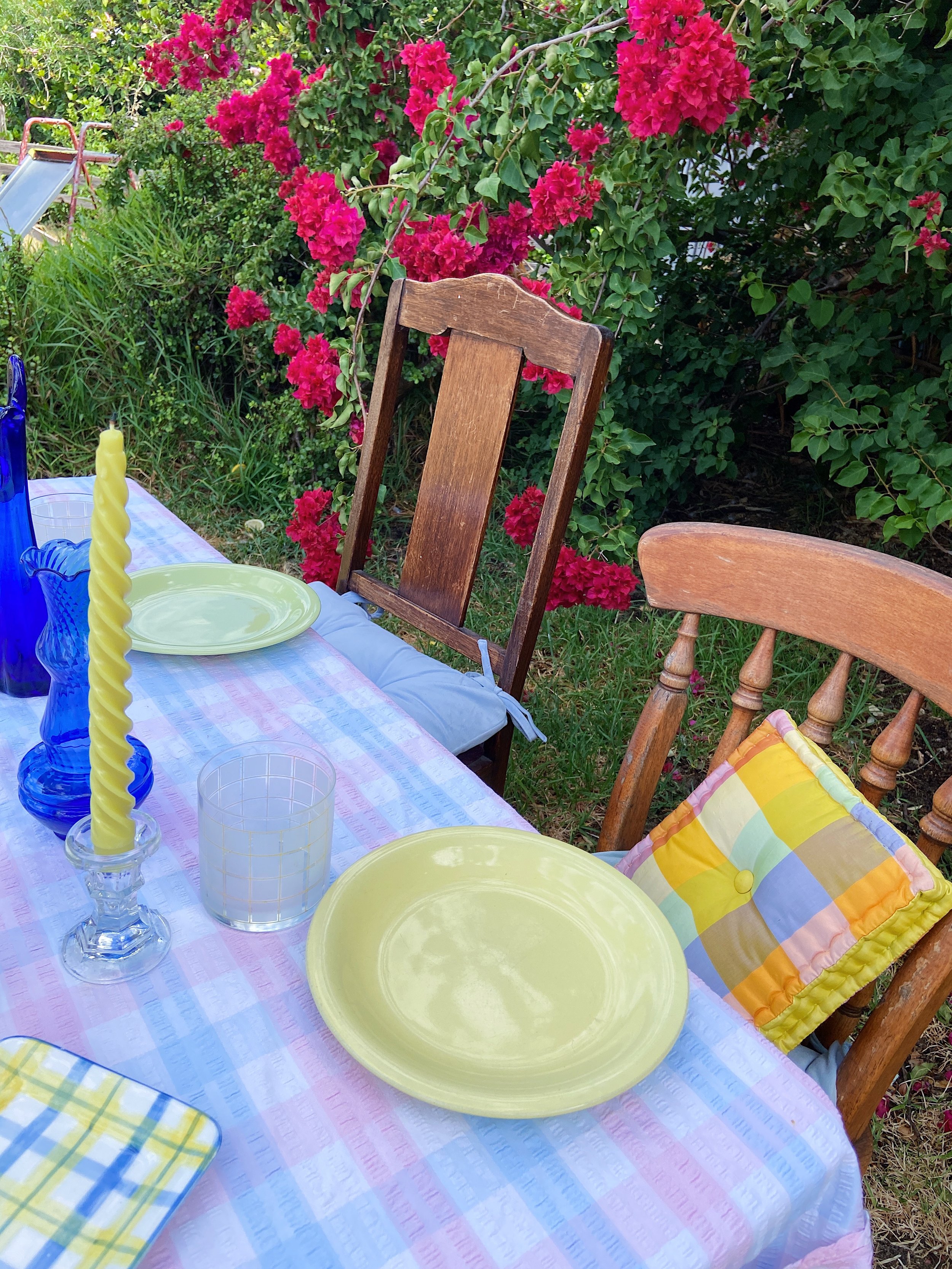
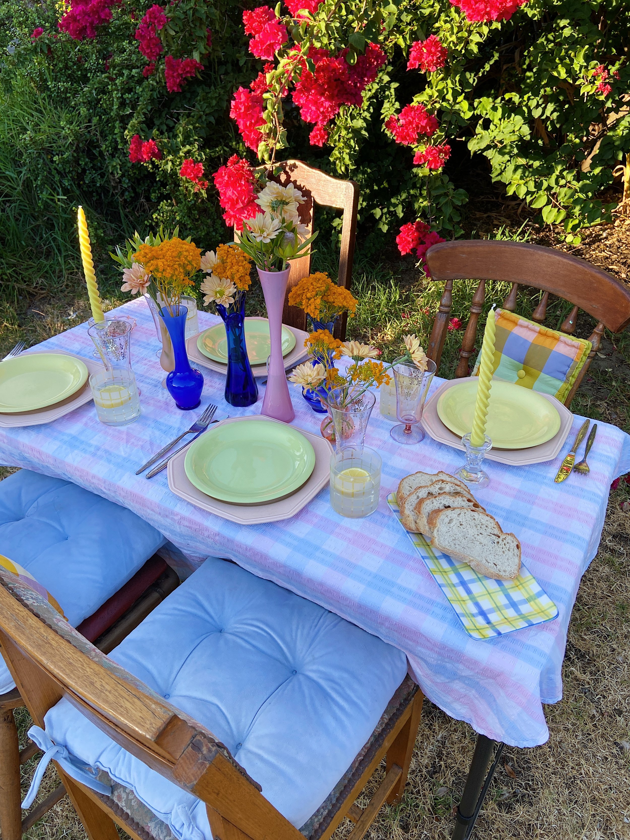
Whenever I am styling anything, I always start with a hero piece. This isn’t necessarily the piece I want to stand out the most or highlight, but it is the piece that connects every other item I select for styling. The minute I found this pastel blue, pink & white check seersucker tablecloth I knew it would be my hero piece. I could instantly picture it being used as a foundation for beach days, picnics or summer dinners, and it started off as the perfect base for my table styling.
STEP TWO: Identify Your Palette To Choose Your Secondary Pieces
When you’ve identified your hero piece, you can then identify your colour palette, patterns and textures. For me, that helped me to decide on two key things I wanted to incorporate into my styling: pastels & checks.
As I was going to be using an eclectic mix of vintage chairs, I popped some pastel blue seat cushions I picked up on marketplace a while ago to anchor the chairs to the styling & give it some cohesion. Then I was ready to choose my secondary pieces.
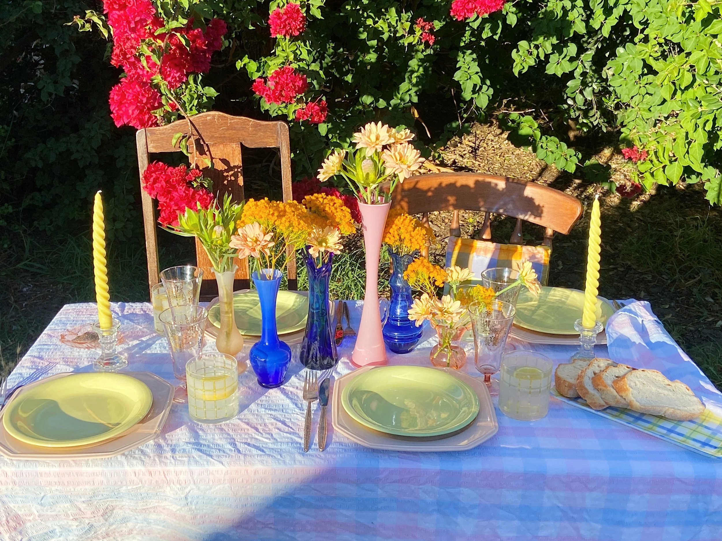
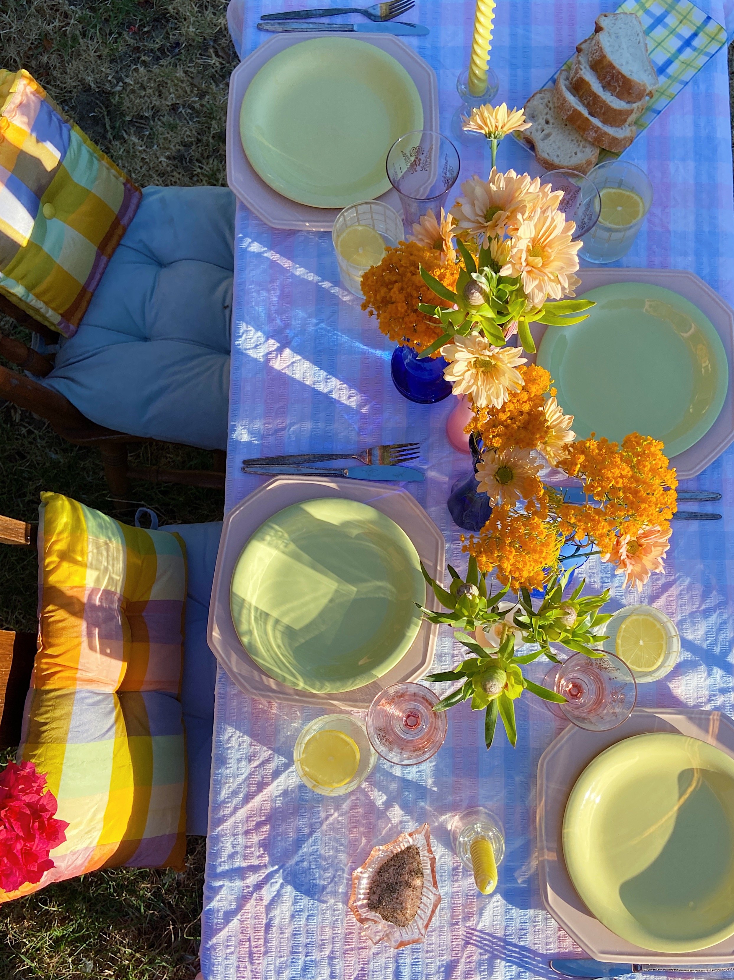
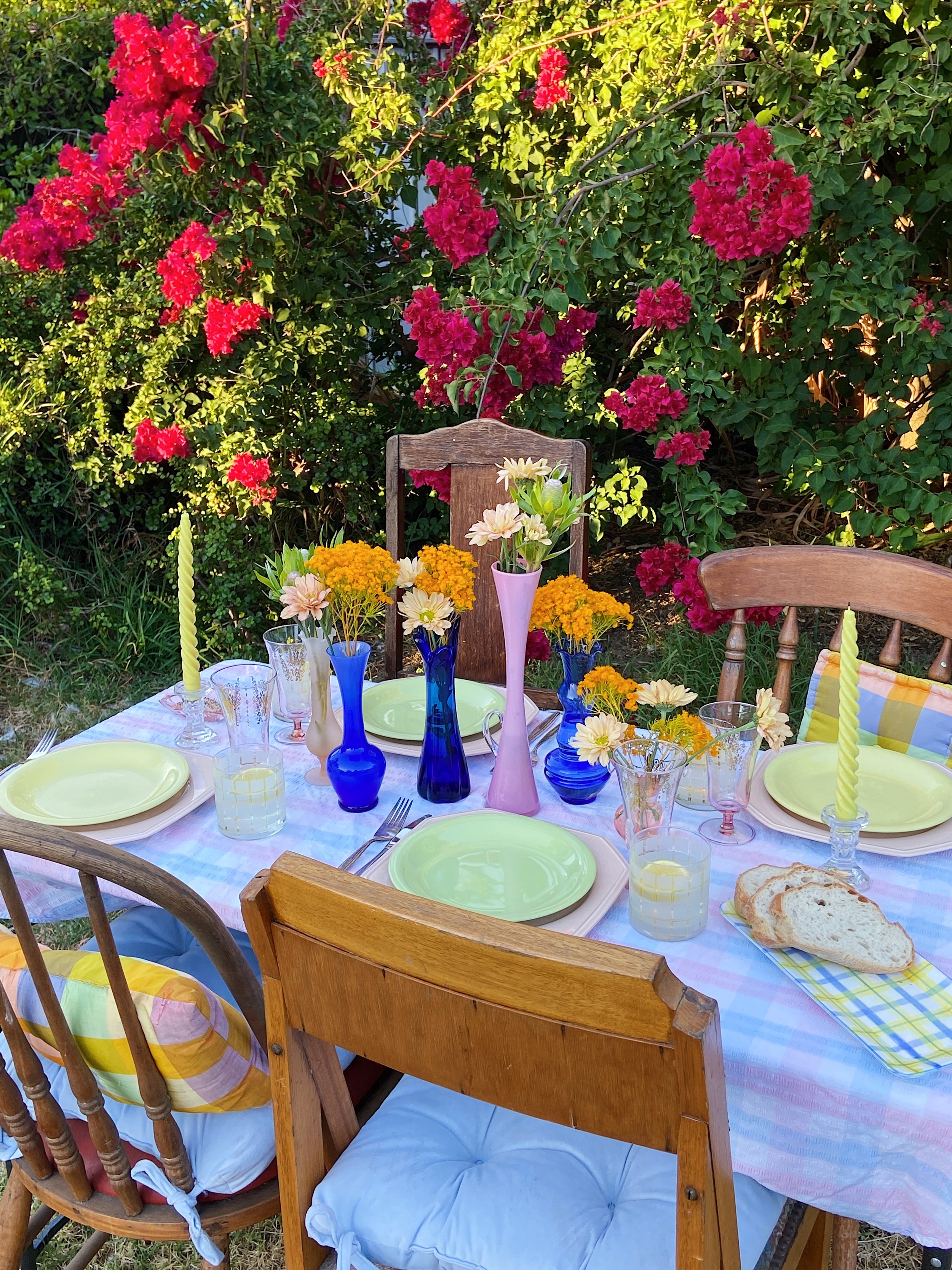
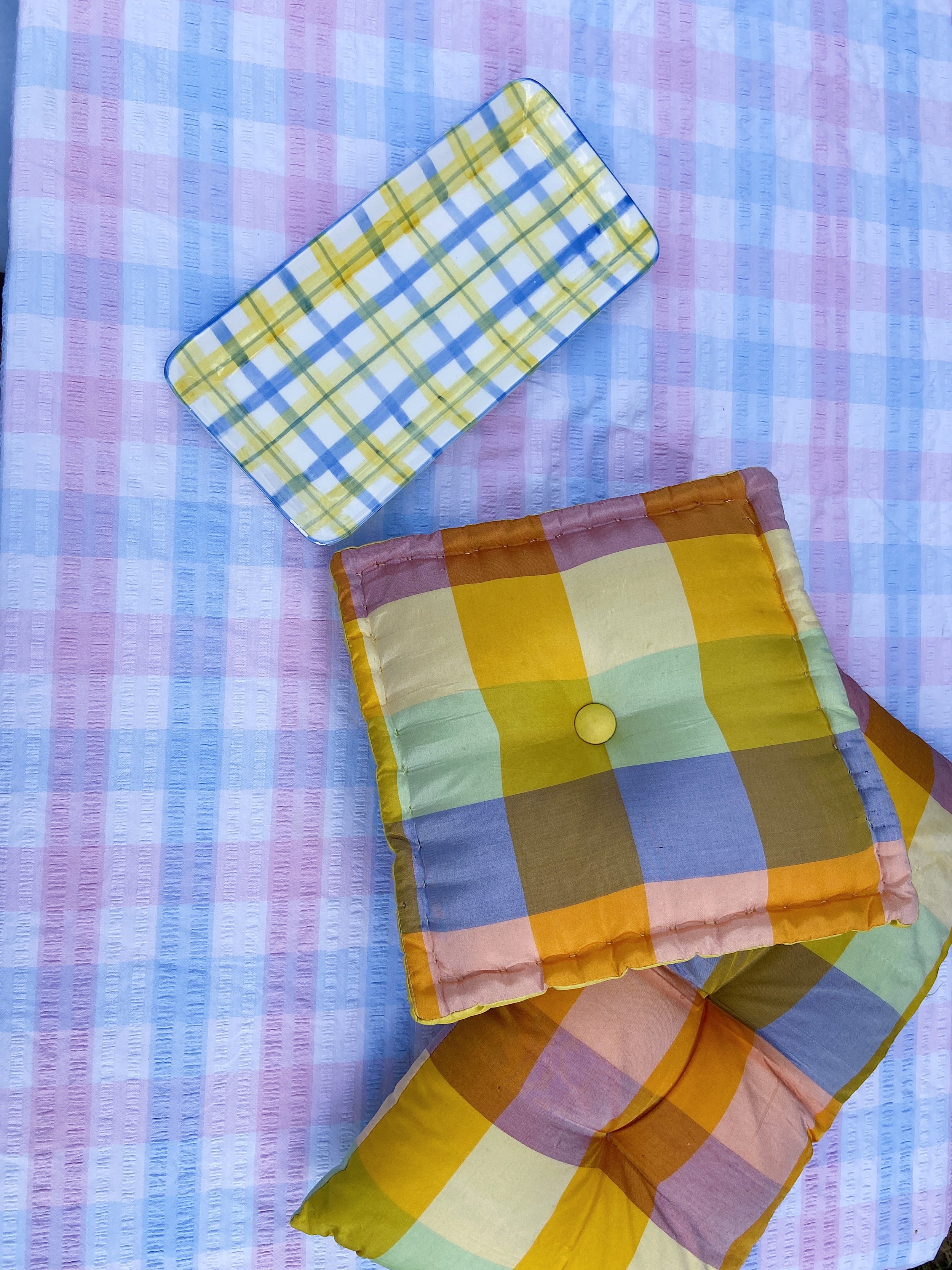
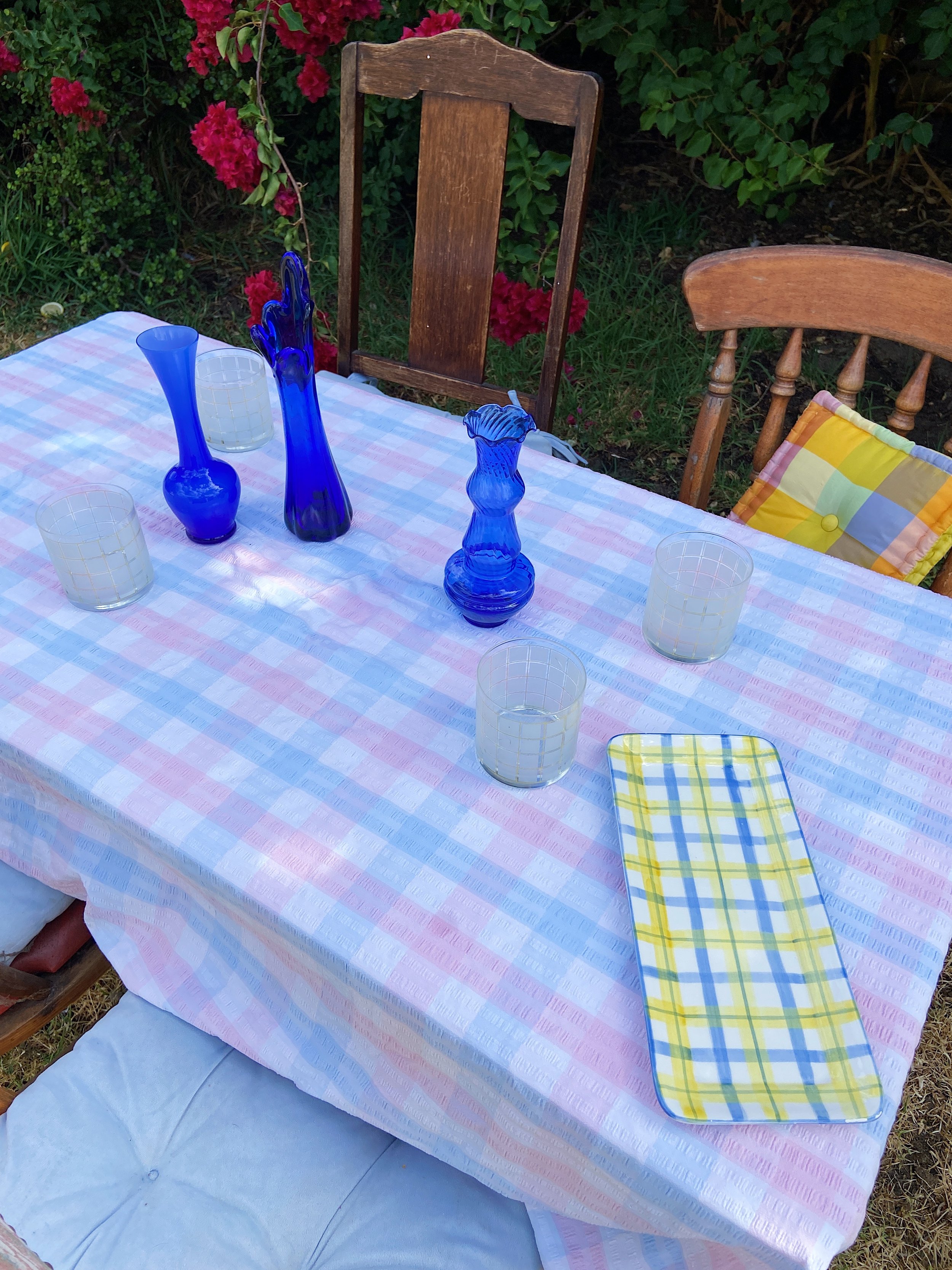
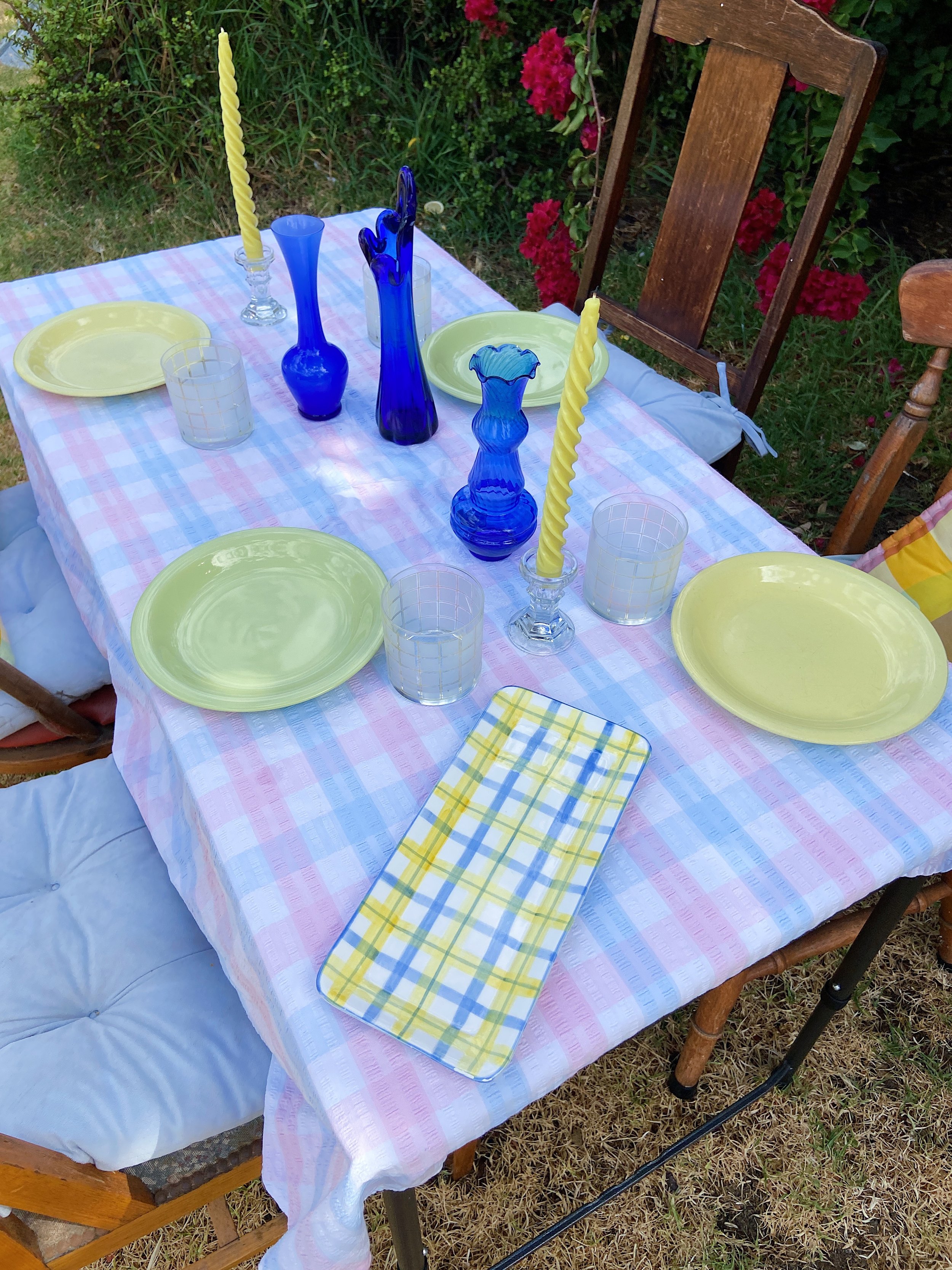
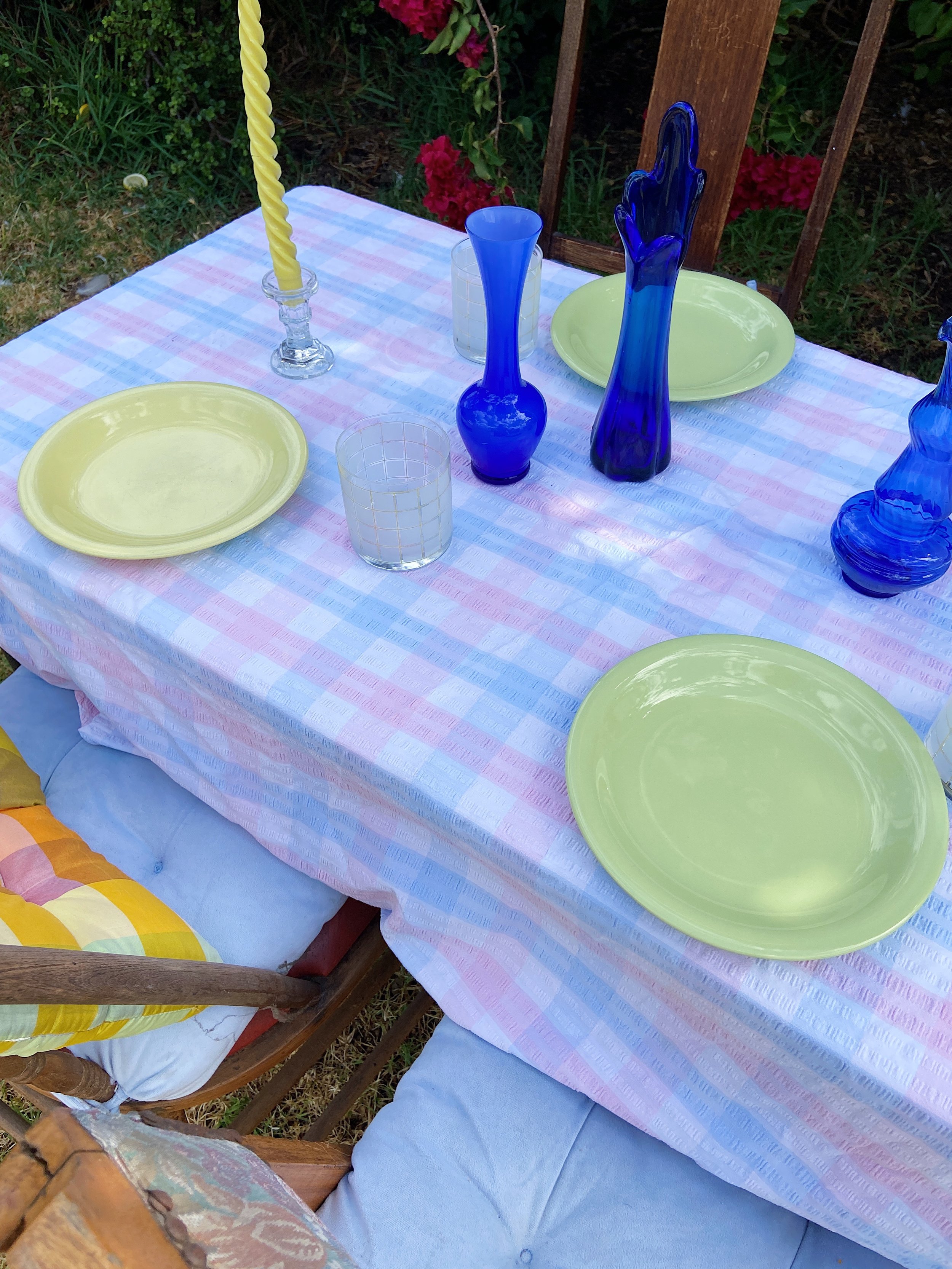
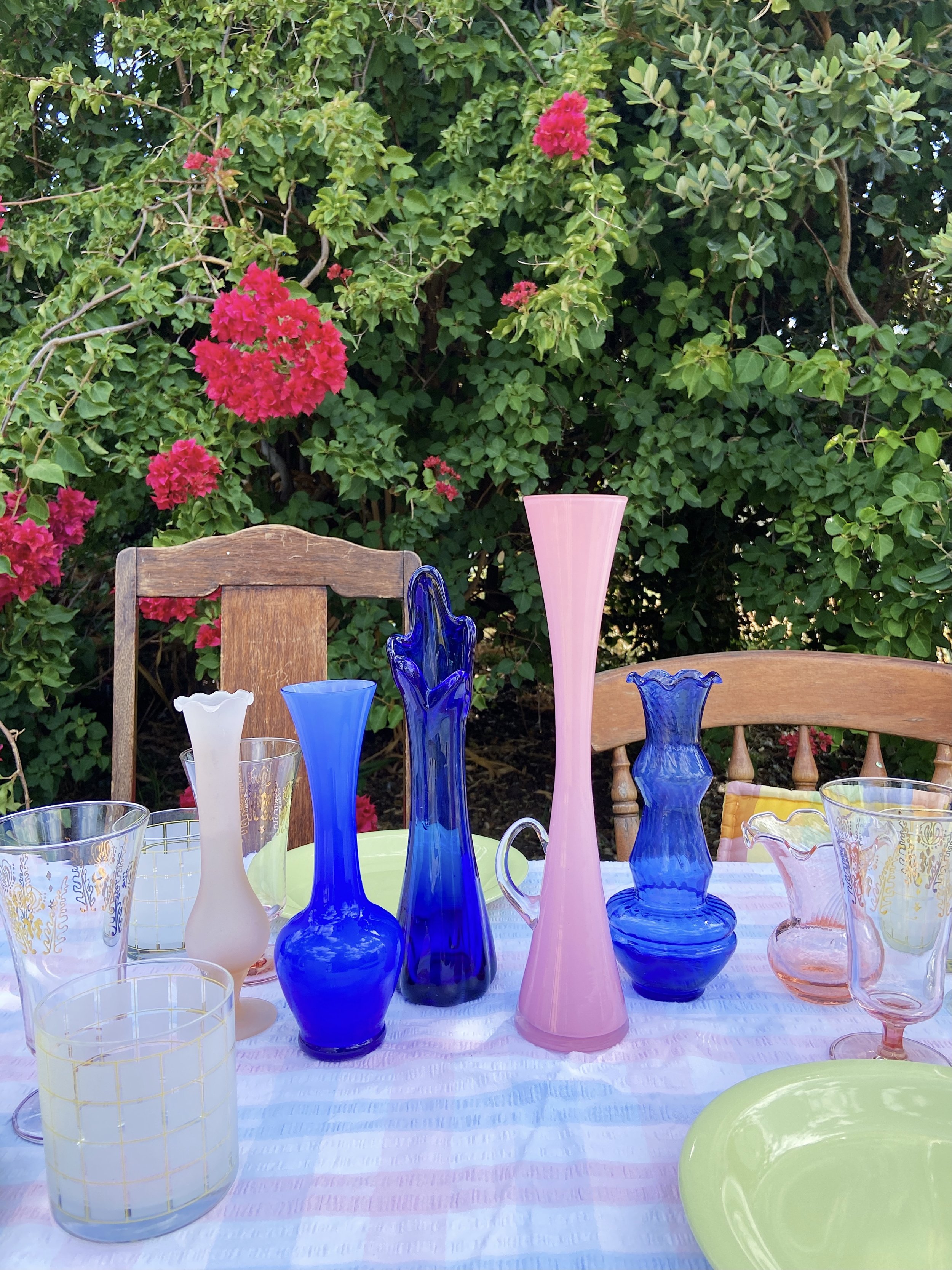
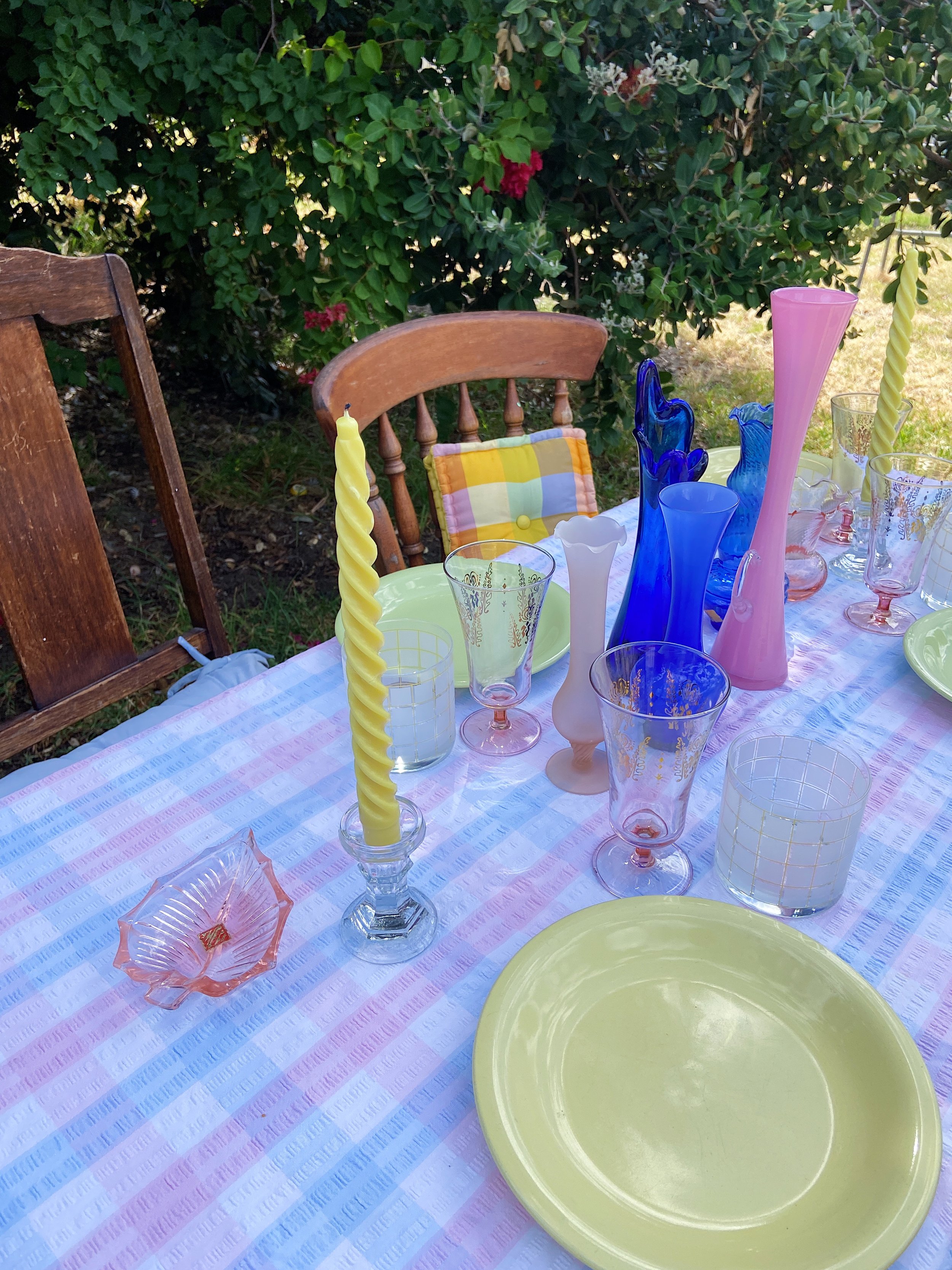
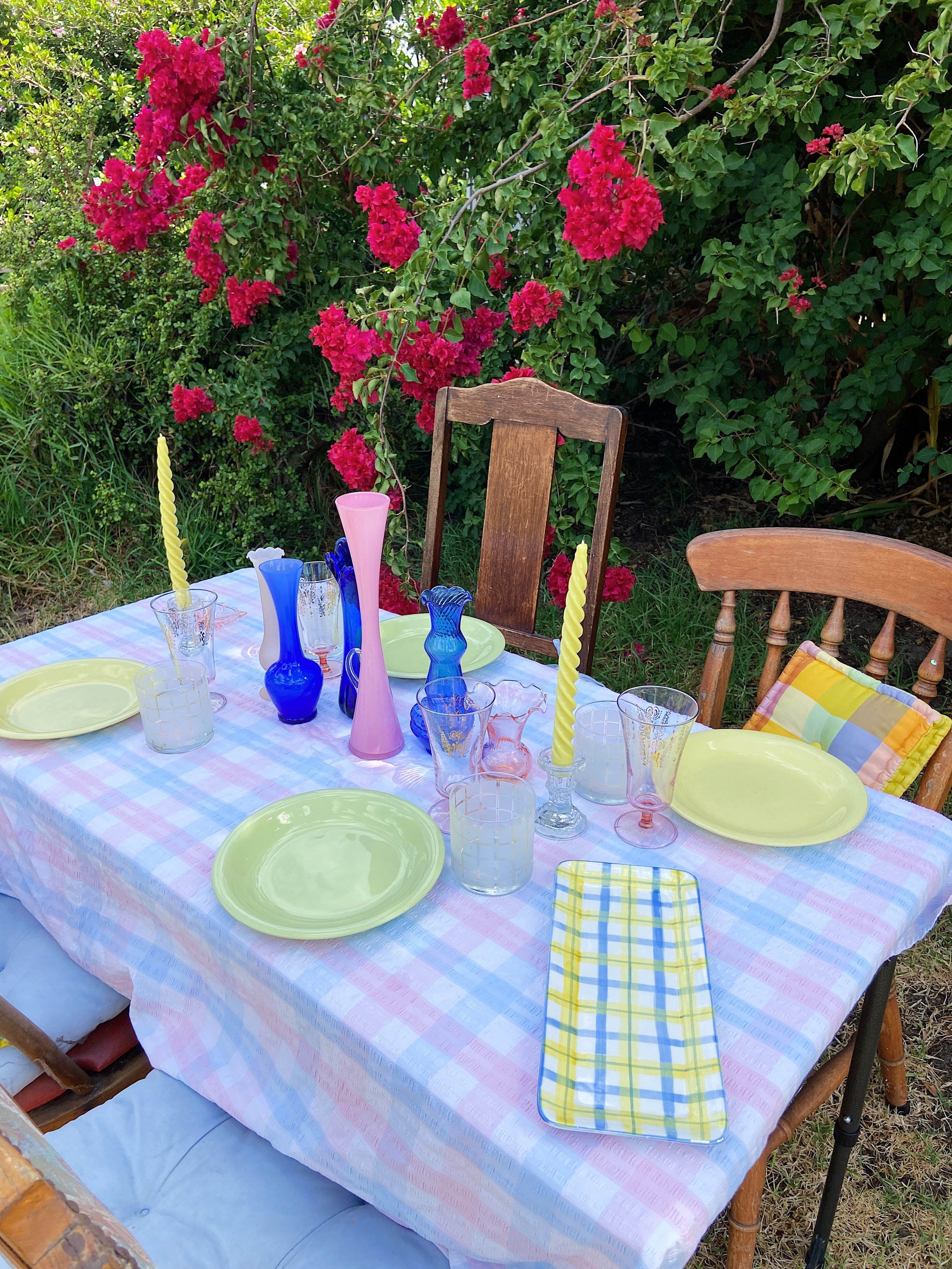
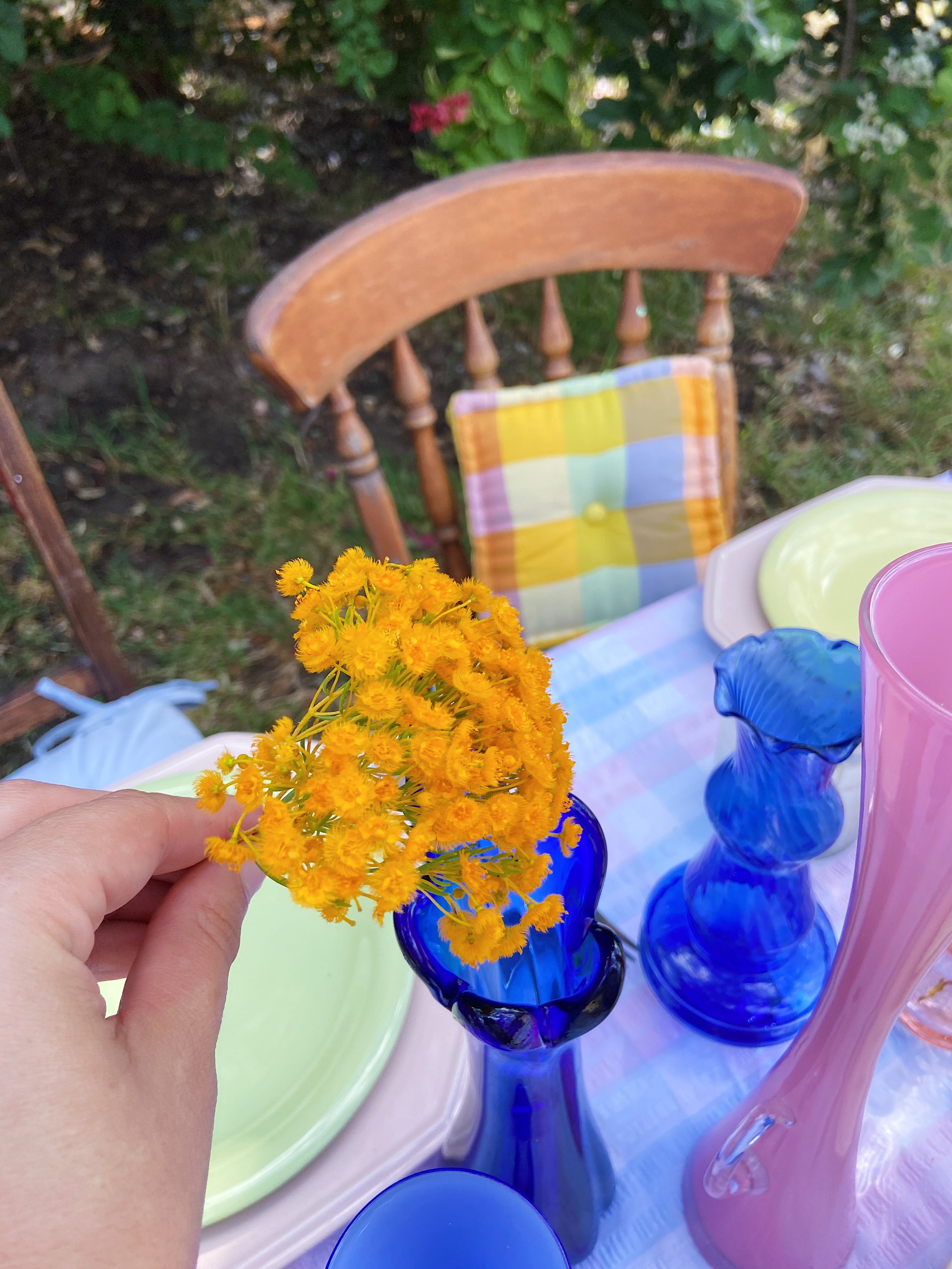
I was drawn to some bright multicoloured check pillows I sourced recently and a yellow & blue check pattern plate. I love the warmth they brought to the table, and it then inspired me to use our yellow & white frosted square patterned tumblers as the water glasses. I also knew with the yellow & blue check plate I would need some richer blues to help anchor it into the design, so I decided on our mid century inky blue bud vases in a range of shapes to add some depth to the table.
My identified palette: Pastel blue, pastel pink, inky blue, pastel yellow, pastel green, slight pops of orange.
My identified pattern: Checks
STEP THREE: Add In Contrasting Pieces
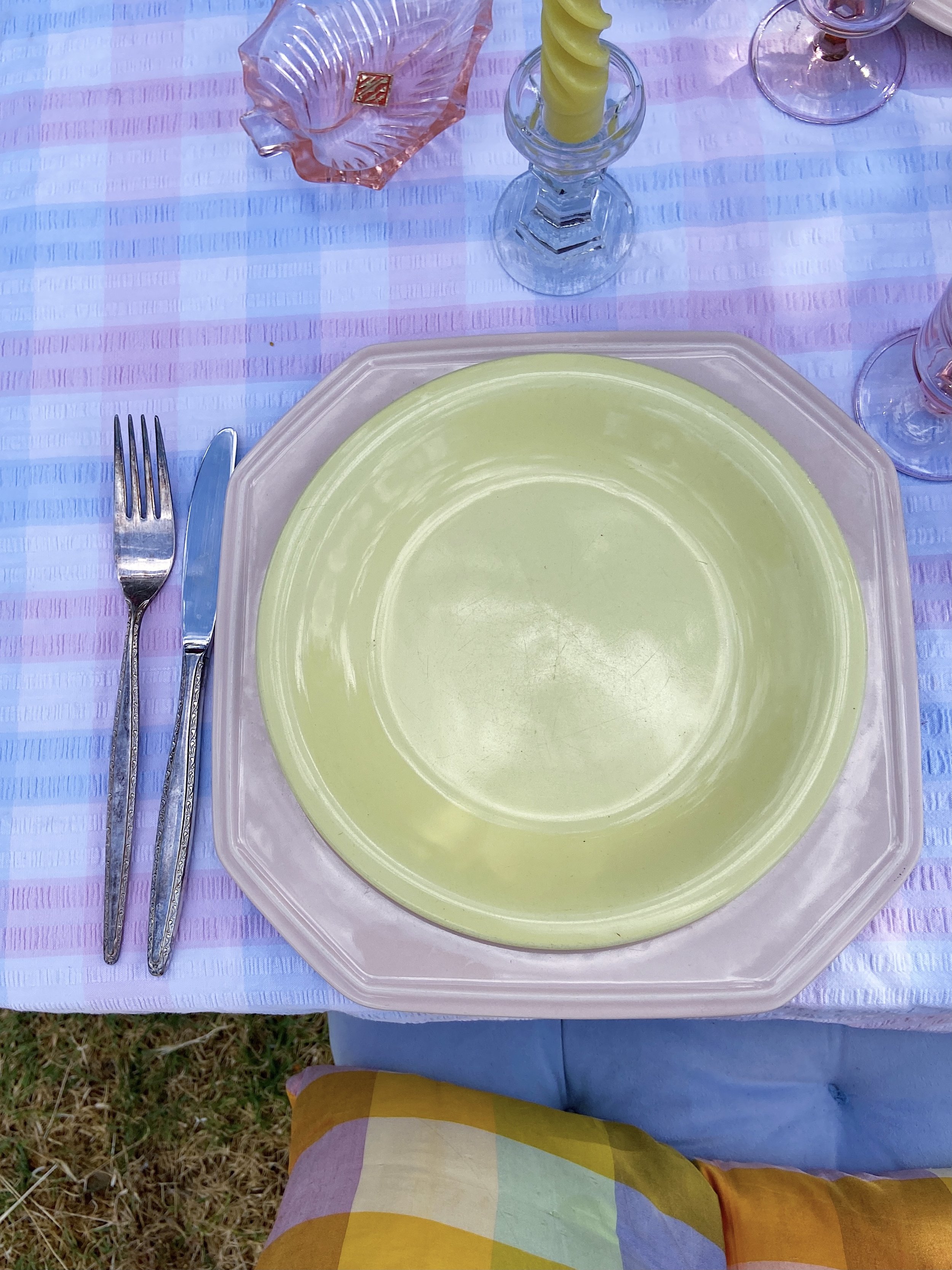
I didn’t want the table to feel too monochromatic, and with prominent colours (like the pastel pink on the tablecloth) it can be quite easy for one colour to take over. To avoid this, I like to add in contrasting pieces first, and build in similar tones second. I decided on some vintage Wembley Ware plates, and ended up going for a mix and match of pastel green & pastel yellow to tie into the colours in the check pillows & the check plate. I love using beautiful candles, and paired these pastel twisted candles (the only non-vintage non-thrifted item in the setting) with some short vintage glass candlestick holders - I opted for these ones as I didn’t want to them to become the focal point.
STEP FOUR: Add In Prominent Colour Pieces
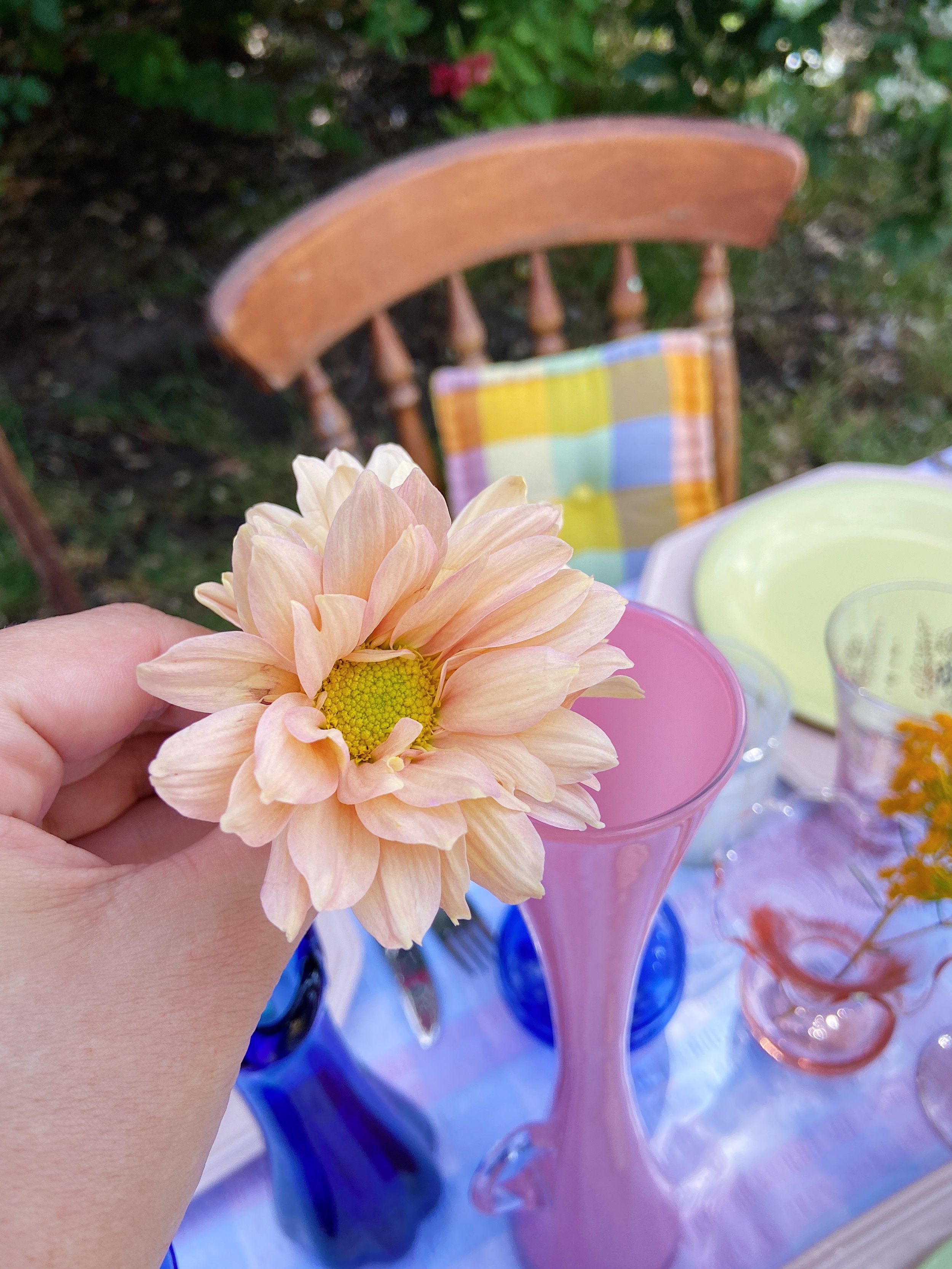
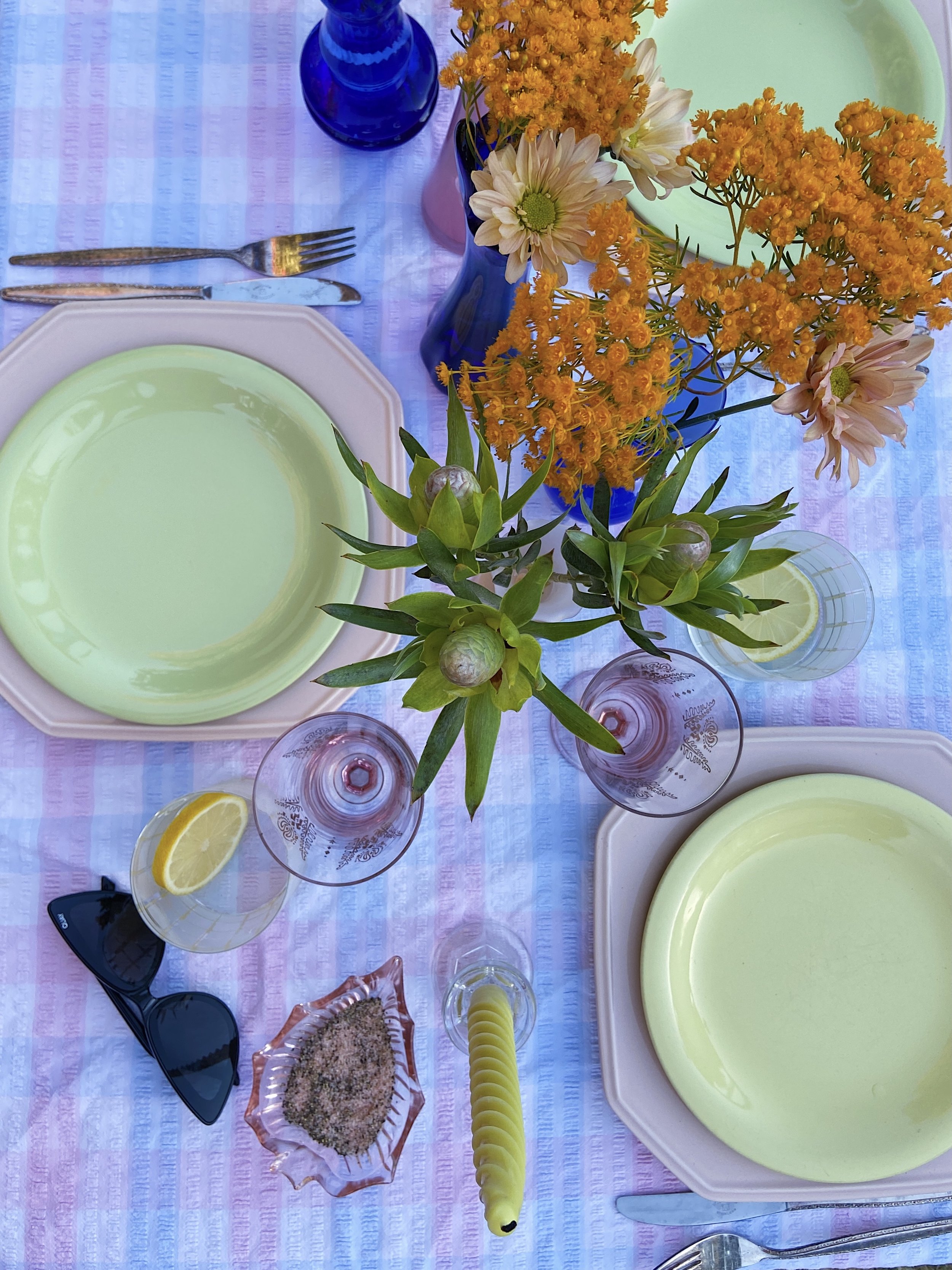
Now that the contrasting pieces are in, I’ve chosen some blush pink/light pink pieces to finish off the styling and anchor in the tablecloth. I chose a beautiful light pink leaf dish that I decided to use as a pinch pot, some pink glass champagne flutes, and some more bud vases in varying hues of pink in different heights - using different heights is one of my favourite ways to create a balanced & beautiful vignette. After doing all of this something about the dining plates wasn’t sitting right with me, so I decided to anchor them with some Mikasa Peach Bloom dinner plates. The colour fit with the palette, but it was the shape that really helped to ground the plates to the table setting as it provided some more hard edges / square lines to go with the checks.
STEP FIVE: Add In Organic Materials
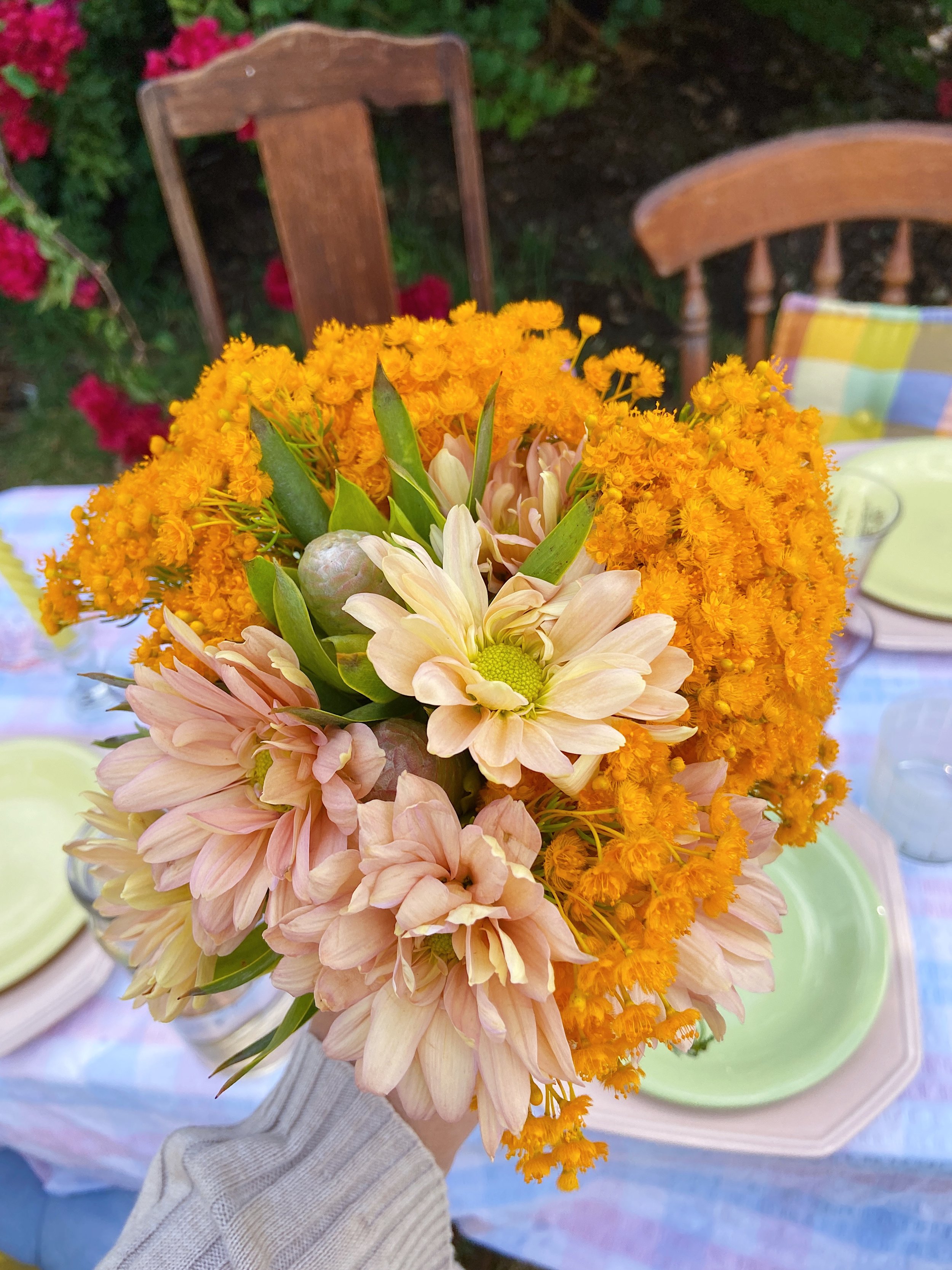
The last thing I like to do is bring in some organic materials into the styling to finish it off. For my table, that meant flowers, salt & pepper for my pinch pot, lemon slices in the tumblers (which also add the perfect pop of yellow) and fresh bread.
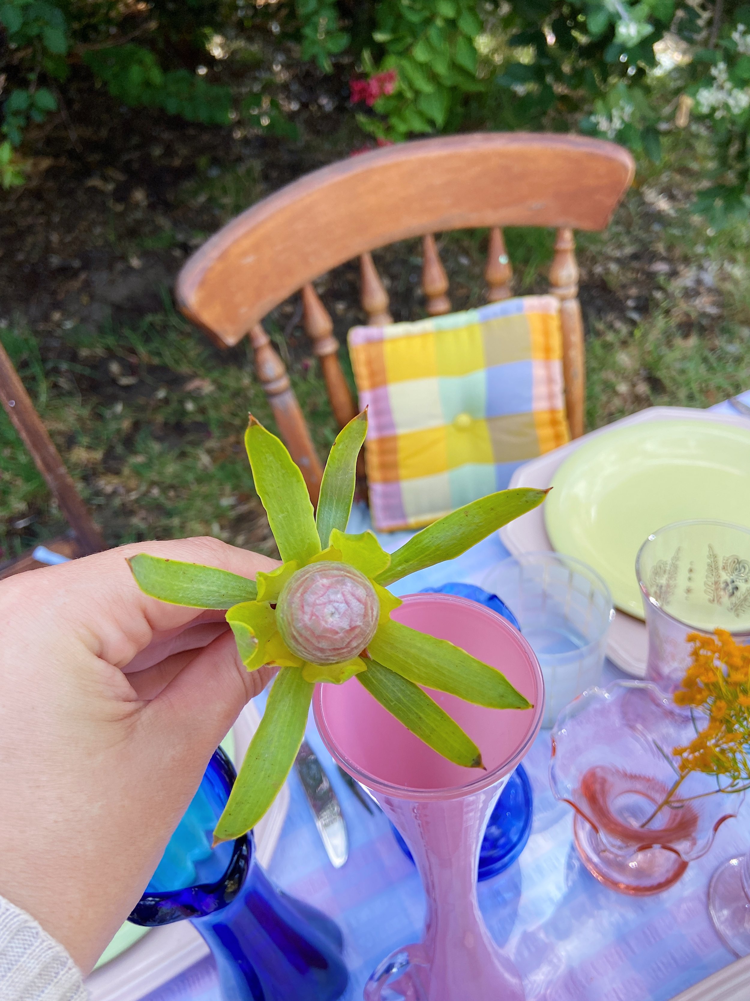
When choosing the flowers I focused on colours that would both compliment & contrast the setting, so I went with bright orange Kotyeningara (Morrison) flower to provide contrast against the inky blue vases whilst complimenting the orange in the check pillows, and some peach Chrysanthemums & Leucadendrons to add more pink tones.
What I love about styling bud vases en masse is that it creates a beautiful whimsical floral arrangement with only a few stems, so it’s a really economical way to include flowers without investing in one big floral arrangement.
I hope you all love how I styled this all together as much as I enjoyed doing it 💕